
Wednesday, October 20, 2010


Tuesday, October 19, 2010


Monday, October 18, 2010
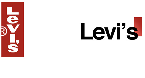
How to gapify your logo in five easy steps.
1. Change your font to Helvetica Bold.
2. Take the most iconic part of your brand, company, etc. and shrink it by a ton. Ignore this if you want.
3. Place the icon in the top-right corner behind the text.
4. Add a slight diagonal or really straight gradient. Ignore this step if you want.
5. Weep.
2. Take the most iconic part of your brand, company, etc. and shrink it by a ton. Ignore this if you want.
3. Place the icon in the top-right corner behind the text.
4. Add a slight diagonal or really straight gradient. Ignore this step if you want.
5. Weep.
Gap
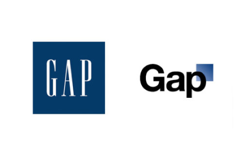
Would you look at this ridiculousness? Well, friends, that’s the new Gap logo. Not a placeholder. The actual logo. They hired Laird & Partners to do that. As a response, I will take all of the world's famous brands, companies, etc. and do them in the spirit (or lack thereof) of the new Gap logo. I will gapify them. You should, too. Bad design is bad business. You think a fashion company would have known that.
About this Blog
As all of you know, Gap has returned to its original logo, but the show must go on! This is what would happen if the designer of the new Gap logo, Laird & Partners, was unleashed on the world's most recognizable brands, companies, etc.
Subscribe to:
Posts (Atom)